how do we use right colours on walls?
Follow these four simple steps to make the process easier and ensure you end up with a color you love.
Step 1: Understand Color Psychology
Before selecting a color, consider the emotions and messages that different hues evoke. For example:
- Red: Energizes and stimulates, great for grabbing attention.
- Blue: Conveys calmness and trust, ideal for professional settings.
- Yellow: Radiates optimism and warmth, but can also signal caution
- Green: Symbolizes nature and balance, perfect for wellness themes.
Step 2: Consider Your Context and Purpose
The setting and intended function of your color choice are crucial:
- Interior Design: Are you creating a relaxing retreat or a lively space? Soft neutrals promote calm, while bold shades can energize a room.
- Branding: Your brand’s personality should shine through your color selection. For instance, fast-food brands often use red and yellow to invoke energy and stimulate appetite.
- Digital Design: Ensure your colors enhance readability and user experience, especially across various devices.
Tailor your choice to the specific environment where the color will be used.
Step 3: Use Design Tools to Create a Harmonious Palette
A harmonious color scheme can elevate your design:
- Complementary Colors: Choose colors that sit opposite each other on the color wheel (e.g., blue and orange) for a vibrant contrast.
- Analogous Colors: Pick colors that are side by side (e.g., blue, teal, green) for a cohesive and calming effect.
- Triadic or Monochromatic Schemes: Experiment with three evenly spaced colors or various shades of a single color to maintain balance.
Leveraging the color wheel helps ensure that your selection works well together and supports your overall design.
Step 4: Test, Refine, and Trust Your Instincts
Finally, don’t rush your decision. Experiment with samples and digital mockups:
- Lighting Matters: Colors can change dramatically under different lighting. Test your chosen palette in natural and artificial light.
- Feedback and Adjustments: Seek opinions from others and make adjustments based on real-world observations.
- Intuition Counts: While theory provides guidance, your personal preference and the specific feel you’re aiming for should ultimately drive your final decision.
Taking the time to test and refine ensures that the colors you choose not only look great in theory but also work beautifully in practice.
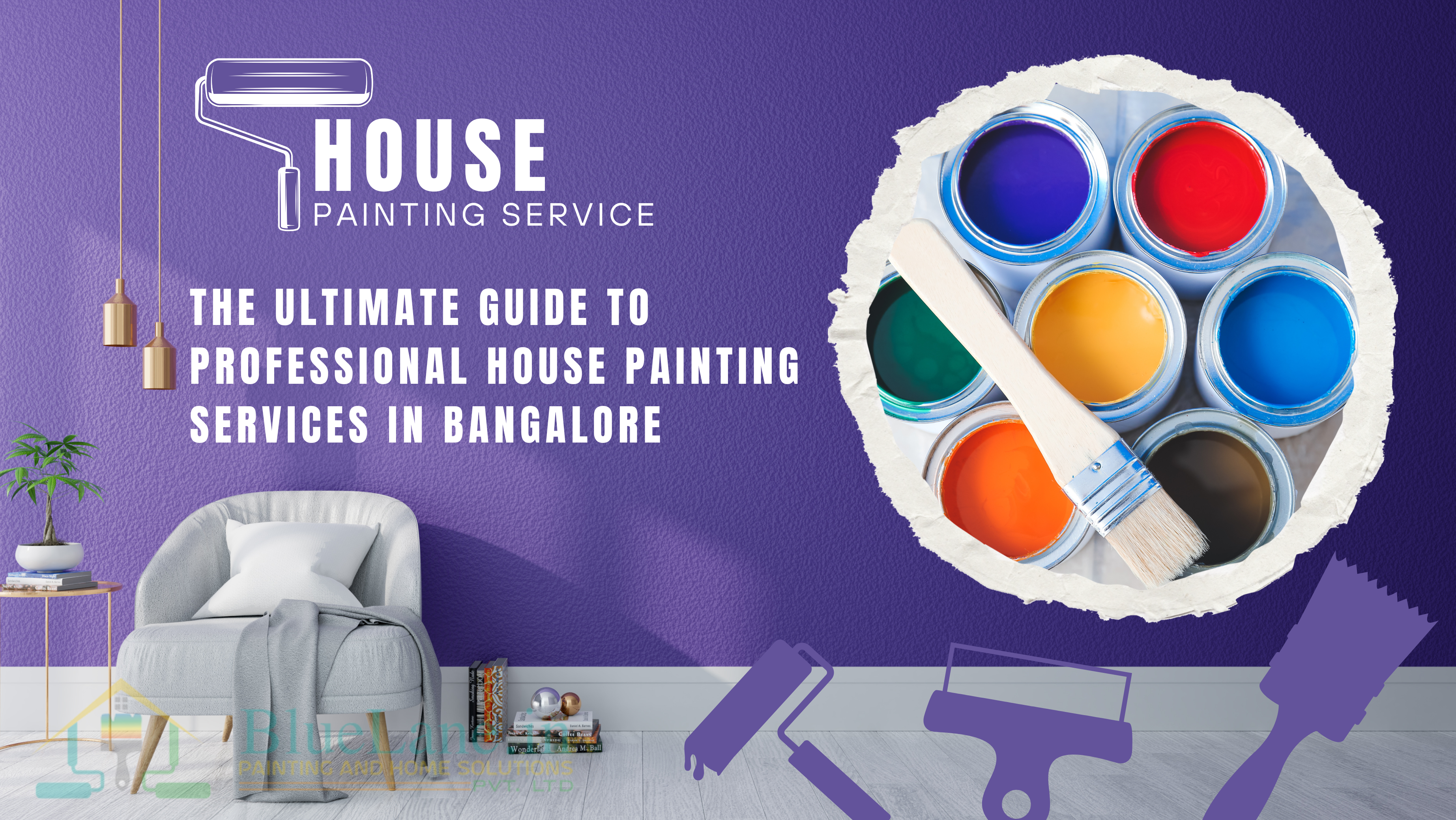
For booking our services in Bangalore(India)https://www.bluelane.in/